Component Reference
A guide to every component type available in the thread builder — what each one does, when to use it, and what fields you can configure.
When you build a thread, you assemble it from components — the visual building blocks that display your fibers. Each component type is designed for a specific job. This reference covers all 16 available types.
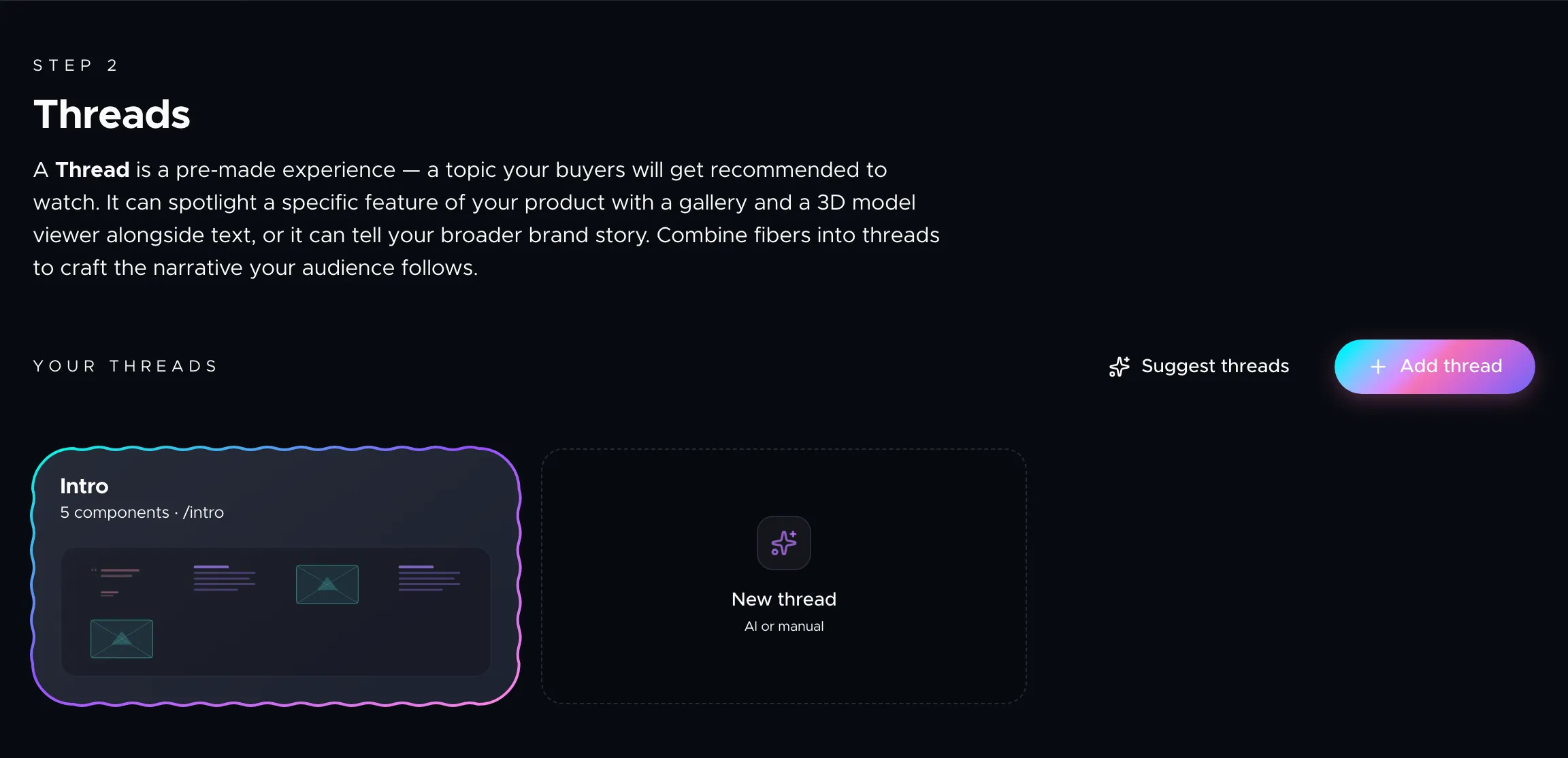
Adding components
In the thread builder, click Add component below any existing component or drag a component from the Component Library panel on the right side of the editor. You can reorder components by dragging them up or down within the thread.
Every component can have fibers attached to it. When fibers are linked, their content fills in automatically — images, text, names, and descriptions all flow from the fiber data you've already entered.
Content components
Carousel hero
The lead component of most threads. It combines an eyebrow label, a headline, rich text body, and one or two CTAs with a swipeable media gallery. Use it to introduce a thread with your strongest value proposition and hero visuals.
Fields: Eyebrow, title, rich text, primary CTA (label + URL), secondary CTA, slides (each with title, text, and media).
Text
A flexible rich text block with an optional title. Use it for storytelling sections, detailed explanations, or any long-form copy that doesn't fit neatly into cards or carousels.
Fields: Title, rich text body, background graphic.
Carousel
A swipeable gallery without the hero layout. Each slide has a title, text, and media (image, video, or 3D model). Good for product shots, comparison angles, or step-by-step visuals.
Fields: Slides (title, text, media).
Cards
A grid of highlight cards. Each card has a title, body text, an optional image, an optional stat number, and an optional CTA. Works well for feature lists, benefit summaries, or FAQ-style content. Supports both normal and compact layout styles.
Fields: Layout style, cards (title, text, image, stat, CTA).
Media components
Image
A single image with an optional caption. The renderer applies cinematic Ken Burns motion and parallax depth effects automatically. Works best for hero product shots or detail close-ups.
Fields: Image source, caption, background graphic.
Video
Embeds a video with playback controls. Supports autoplay, loop, and muted options. You can set a specific play from and play to time to show just a clip. Great for demos, unboxing videos, or ambient product footage.
Fields: Video source, caption, autoplay, loop, muted, play from, play to.
3D model
An interactive 3D model viewer. Buyers can rotate and zoom the model. You can define hotspots — labeled points on the model that reveal detail text when tapped. Use for products where shape, texture, or size matters.
Fields: Model source, hotspots, customization options.
Embed
An iframe embed for external content — YouTube videos, interactive demos, calculators, or any third-party widget. Provide a URL and optional caption.
Fields: URL source, caption.
Conversion components
CTA
A prominent call-to-action block with a headline, description text, and a button. Place it at the end of a thread or between sections to drive the next step: "Buy now", "Book a demo", "Download spec sheet".
Fields: Title, description, label, URL.
Pricing
A plan comparison block. Each plan has a name, price, description text, a feature list, an optional highlight flag, and a CTA. Use it to present pricing tiers or product bundles side by side.
Fields: Plans (name, price, text, features, highlight, CTA).
Form
A lead capture or contact form. Define custom fields (text, email, phone, select), a submit button label, and a privacy note. Form submissions are collected and can trigger notifications.
Fields: Headline, subheading, form fields (label, type, required, placeholder), submit CTA, privacy note.
Social proof components
Quote
A testimonial or pull quote. Shows the quote text, the author name, and their role or company. Use it to build trust with real customer voices between product sections.
Fields: Quote text, author name, role.
Rating summary
Displays an aggregate rating score with a review count — for example, "4.8 ★ from 128 reviews". A quick credibility signal that works well near decision points.
Fields: Rating number, review count, label.
Logo strip
A row of partner, client, or press logos with an optional heading like "Trusted by". Upload logo images and label each one. The renderer animates them into view with a background gallery effect.
Fields: Heading, logos (image, label).
Data components
Table
A comparison or specification table. Define column headers and data rows. Ideal for technical specs, feature comparisons, or side-by-side plan differences in a structured format.
Fields: Column headers, rows.
Timeline
A sequence of dated or labeled steps. Each entry has a date label, title, and body text. Use it for product roadmaps, onboarding workflows, or chronological brand stories.
Fields: Entries (date, title, text).
Combining components in a thread
A typical thread might look like this:
- Carousel hero — introduce the product with hero imagery and a CTA.
- Text — tell the brand story or explain the core problem.
- Cards — highlight three key features.
- Image — show a detail shot with cinematic depth.
- Quote — add a customer testimonial for trust.
- Pricing — present plans or bundles.
- CTA — close with a strong call to action.
There's no fixed rule — experiment with different arrangements. The AI thread suggestion feature can also propose component sequences based on your fibers.
Next steps
Learn how to arrange multiple threads into a complete buyer journey in Building Threads, or customize how your components look in Styling Your Weave.